Introduction
Have you ever noticed the dynamic little icons in your browser tab that magically adjust to your dark or light mode settings? These icons, known as adaptive favicons, are more than mere embellishments; they're pivotal elements in web branding. In today's digital age, where a stellar user experience is king, such subtle touches go a long way in boosting user engagement and brand identity.
Focusing on adaptive favicons isn't just about following trends; it's about embracing a crucial aspect of modern web design that enhances brand recognition and user interaction. In this guide, we'll dive into the importance of these smart little icons and provide a step-by-step tutorial on implementing them in your Next.js projects. From understanding their role in digital branding to tweaking them for different themes, this guide aims to transform your website's favicon into a responsive design element.
Now that we've set the stage for the significance of adaptive favicons in the modern web landscape let's take a step back. It's crucial to understand the basics before diving into the technicalities. What exactly is a favicon, and why has it become a staple in web branding and user experience? This section will not only answer these questions but also shed light on the evolution of favicons and their growing importance in today's dynamic web environments.
The Significance of Favicons in Web Identity
Originating in 1999 with their debut in Internet Explorer 5, favicons began as visual markers for Internet explorers to distinguish between tabs and bookmarks easily. These small yet impactful graphics have since transcended their humble beginnings to become integral components of a website's brand and user interface. The evolution of the favicon is a testament to its enduring importance in an increasingly cluttered digital landscape.
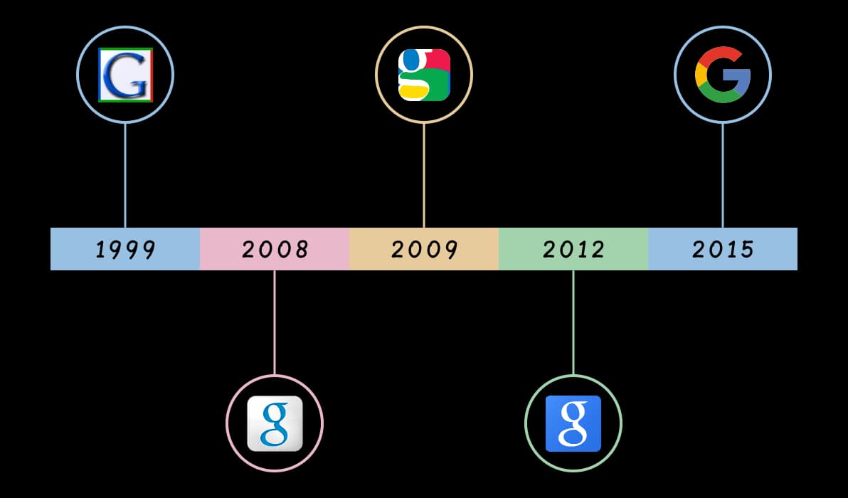
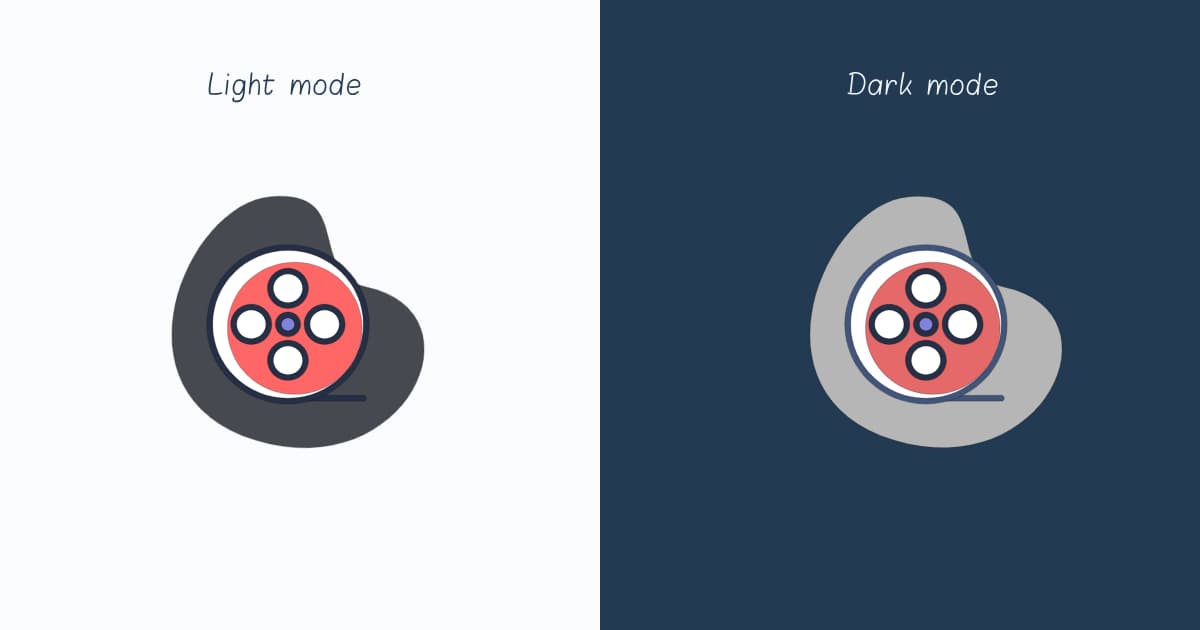
The significance of a favicon extends well beyond its size. It symbolizes a site's essence, guiding users as they navigate the vast ocean of browser tabs. Adaptive favicons take this concept further. They are designed to seamlessly switch between light and dark versions, aligning with the user's system theme. Such adaptability underscores a commitment to thoughtful user engagement and interface fluidity.
Having explored what favicons are and their significance, it's time to roll up our sleeves and dive into the creative process. Designing a favicon might seem straightforward, but it requires a blend of creativity and technical know-how, especially when aiming for adaptability.
Simple Design, Strong branding
The process of designing your favicon should center on simplicity and recognizability. Due to its small size, your favicon must be straightforward and easily identifiable. Choose one or two key elements encapsulating your brand, like a logo or symbol. Consistency in color scheme and style with your overall brand identity is crucial.
It's essential to consider their appearance in both light and dark modes for adaptive favicons. Typically, this involves crafting two separate versions of your icon. Each version should be designed to stand out against contrasting backgrounds, ensuring your favicon remains visible and distinct regardless of the user's theme preference.
Bear in mind that crafting a favicon transcends mere technical execution; it's a form of artistry. This small digital icon is a canvas for your brand's essence, offering a chance to connect with users in a distinctive and lasting way.
To ensure that your website is compatible with modern browsers and devices, it's essential to include various sizes for favicons, like 192x192 for Android and 180x180 for iOS's apple-touch-icon. This ensures optimal display across platforms. For ease, you can use online tools like realfavicongenerator and faviconio to create these different sizes and formats efficiently.
Transitioning from the design aspect, let's focus on effectively implementing these adaptive favicons in a Next.js project. This section will provide a detailed guide, combining the setup of your environment with the actual implementation process.
Implementing Adaptive Favicons in Next.js
Firstly, ensure that your Next.js application is operational. This article primarily focuses on Next.js version 14, yet it is pertinent to note that any version beyond 13 incorporating the app folder structure is suitable. For guidance on setting up your environment, refer to the official Next.js documentation or consult this relevant section.
Building on the foundation of an operational Next.js application, you'll find that the latest versions, especially those using the app directory structure, offer a remarkably streamlined approach to favicon management. Simply placing a favicon.ico file in the app directory, Next.js intuitively recognizes and serves it as the favicon for your entire application. This efficiency eliminates the need for extra configuration or explicit linking in your layout or page files, making the process straightforward and hassle-free.
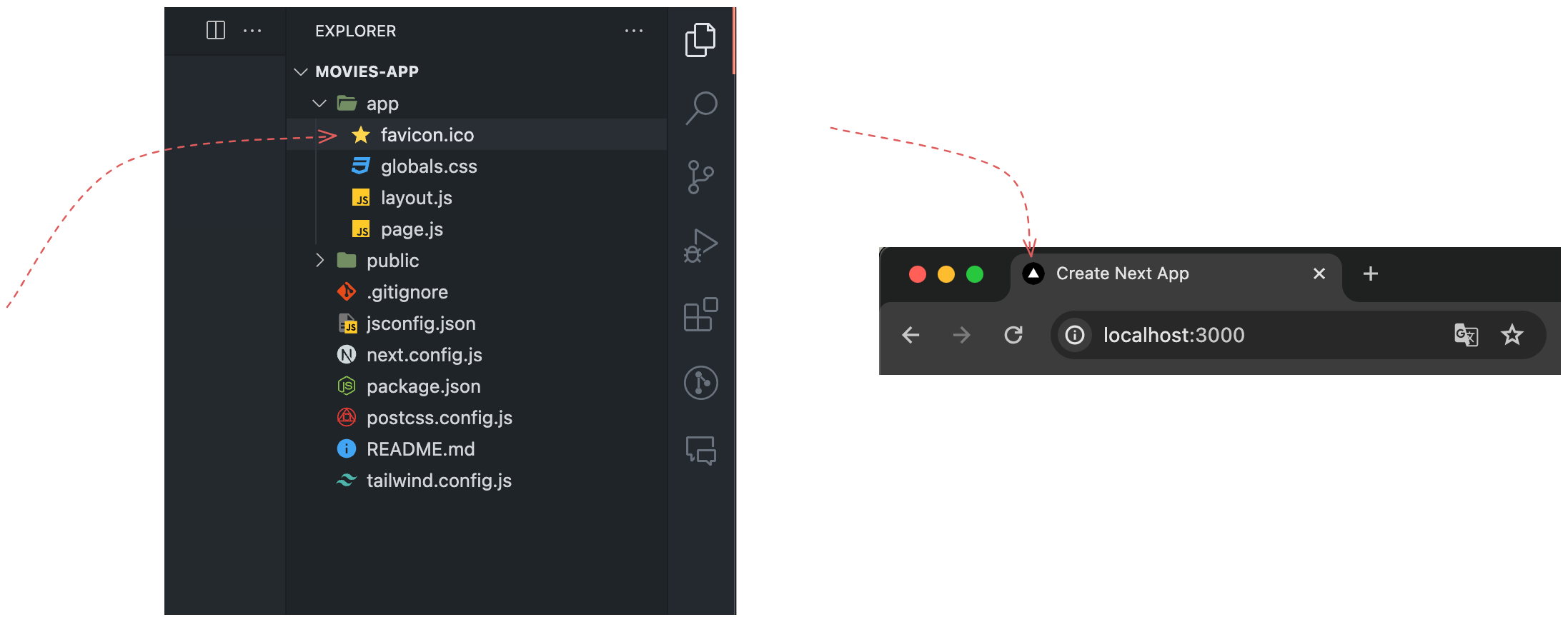
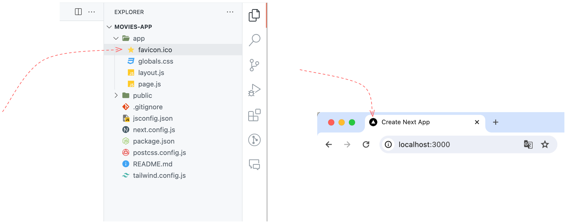
Let's see how Next.js's streamlined favicon management is reflected in your application. Below is an HTML code snippet that exemplifies Next.js's automatic incorporation of the favicon. This part of the code can be viewed in the Elements tab of your browser's developer tools, revealing how Next.js operates when you place your favicon.ico file in the app directory.
<head>
	<meta charset="utf-8">
	<meta name="viewport" content="width=device-width, initial-scale=1">
	<link rel="icon" href="/favicon.ico" type="imag/x-icon" sizes="16x16">
	<!-- Other tags -->
</head><head>
<meta charset="utf-8">
<meta name="viewport" content="width=device-width, initial-scale=1">
<link rel="icon" href="/favicon.ico" type="imag/x-icon" sizes="16x16">
<!-- Other tags -->
</head>While the traditional .ico format has long been the standard for favicons, modern web development practices have expanded to embrace more versatile formats like PNG, JPG, and SVG. These formats offer greater flexibility and capabilities, especially when creating adaptive favicons that respond to user preferences, such as light or dark modes.
In contrast to the .ico format, these newer formats allow for higher-resolution images, a more comprehensive range of color depths, and scalability without loss of quality in the case of SVGs. This makes them ideal for creating crisp, clear favicons that enhance the visual appeal of your site across various devices and resolutions.
In this tutorial, we'll mainly focus on how to use PNG and SVG files to handle adaptive favicons. These formats not only provide better compatibility with modern browsers but also open up creative possibilities for responsive design. Let's begin by exploring how to use PNG files to create adaptive favicons that dynamically adjust to light and dark modes.
Using PNG Files for Adaptive Favicons
With the app directory structure, you can handle this elegantly using metadata (introduced in v13.2.0). This approach involves defining a metadata object that specifies separate favicon images for light and dark modes.
Ensure you have both icon variations ready, one tailored for each mode. Place these icons in the public folder.
In your layout.js file, you'll find a predefined metadata object that includes properties like title and description. These are known as meta properties, which are important in SEO optimization. Let's enhance this metadata object by adding a new property named 'icons.' This property will have a child property called 'icon', which holds an array of icons.
export const metadata = {
	title: 'Create Next App',
	description: 'Generated by create next app',
	icons: {
		icon: [
			{
				rel: 'icon', // optional, 'icon' is the default value
				type: 'image/png',
				media: '(prefers-color-scheme: light)',
				url: '/icon-light.png'
			},
			{
				rel: 'icon', // optional, 'icon' is the default value
				type: 'image/png',
				media: '(prefers-color-scheme: dark)',
				url: '/icon-dark.png'
			}
		]
	}
};
export const metadata = {
title: 'Create Next App',
description: 'Generated by create next app',
icons: {
icon: [
{
rel: 'icon', // optional, 'icon' is the default value
type: 'image/png',
media: '(prefers-color-scheme: light)',
url: '/icon-light.png'
},
{
rel: 'icon', // optional, 'icon' is the default value
type: 'image/png',
media: '(prefers-color-scheme: dark)',
url: '/icon-dark.png'
}
]
}
};There are in fact two types of icons: icon and apple-touch-icon. The later is used for iOS devices. Read more about these types of icons in Next.js official docs.
In this metadata setup, we define two favicon images: icon-light.png for light mode and icon-dark.png for dark mode. The media attribute plays a key role here, specifying the preferred color scheme for each image.
Beyond these, there are several other properties worth exploring. If you're using TypeScript, you'll notice that the icon object aligns with the IconDescriptor interface. This interface is designed to detail each favicon's characteristics thoroughly. Let's dive into the properties of this interface and understand their contribution to your favicon setup:
url: This is the most crucial property, specifying the path to the favicon file. The value can be astringor aURLobject.type: While optional, this property is highly recommended. It specifies the MIME type of your icon file, likeimage/pngorimage/svg+xml. Declaring the type guides the browser on how to process the file effectively. see MDN's list of MIME types for more details.sizes: An optional attribute, valuable for indicating the favicon's size. This becomes crucial when using different-sized favicons for varied applications, such as a larger icon for a mobile device's home screen.color: Mainly used with SVG icons, this property sets a default color. It's handy for icons that must adapt to various themes but don't have multiple color variations.rel: This property defines the relationship between your document and the linked resource. While it defaults to"icon", it can be tailored as needed, offering versatility for link types like"apple-touch-icon".media: Essential for adaptive favicons, it lets you set the media query for the icon. For example, (prefers-color-scheme: dark) tells the browser to use that specific icon when the user's system is in dark mode.fetchPriority: Influencing how the browser prioritizes the loading of the favicon, this property can have valueshigh,low, orauto.
If you want to read more about the metadata object and its properties, refer to the official documentation.
Next.js intelligently leverages this metadata to automatically generate the necessary <link> tags within the HTML <head> section. As a result, the generated HTML output in your project will resemble the following snippet:
<head>
    <meta charset="utf-8">
    <meta name="viewport" content="width=device-width, initial-scale=1">
    <link rel="icon" href="/icon-light.png" type="image/png" media="(prefers-color-scheme: light)">
    <link rel="icon" href="/icon-dark.png" type="image/png" media="(prefers-color-scheme: dark)">
    <meta name="next-size-adjust">
    <script src="/_next/static/chunks/polyfills.js" nomodule=""></script>
</head><head>
<meta charset="utf-8">
<meta name="viewport" content="width=device-width, initial-scale=1">
<link rel="icon" href="/icon-light.png" type="image/png" media="(prefers-color-scheme: light)">
<link rel="icon" href="/icon-dark.png" type="image/png" media="(prefers-color-scheme: dark)">
<meta name="next-size-adjust">
<script src="/_next/static/chunks/polyfills.js" nomodule=""></script>
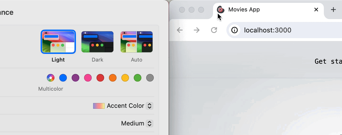
</head>These <link> tags tell the browser which favicon to display based on the current color scheme preference of the user's system. This dynamic selection ensures that the favicon is always aligned with the overall visual theme of the user's device, enhancing the user experience.
Now, the favicon will change automatically:
Using a S SVG File for Adaptive Favicons
SVGs offer scalability and flexibility, making them ideal for creating responsive designs, including favicons that adapt to different modes or themes.
With SVGs, you can control the appearance of your favicon based on CSS media queries or JavaScript, allowing for dynamic changes between light and dark modes within a single file. This method can be particularly efficient because it reduces the resources the browser needs to load.
Within your SVG file, embed CSS that reacts to the user's preference for light or dark modes. This is seamlessly achieved using CSS media queries embedded directly in the SVG. Consider the following example:
<svg width="128" height="128" viewBox="0 0 128 128" fill="none">
	<style>
			/* Default styles */
	    path {
	        stroke: black;
	        stroke-width: 0.25;
	    }
	    .color-1 {
	        fill: #474951;
	    }
	    .color-2 {
	        fill: #253046;
	    }
	    .color-3 {
	        fill: #FF6666;
	    }
			/* Styles for dark mode */
	    @media (prefers-color-scheme: dark)  {
	        .color-1 {
	            fill: #B6B6B6;
	        }
	        .color-2 {
	            fill: #41557B;
	        }
	        .color-3 {
	            fill: #E56969;
	        }
	    }
	</style>
	<path d="..." class="color-1"/>
	<path d="..." class="color-2"/>
	<path d="..." fill="white"/>
	<path d="..." class="color-2"/>
	<path d="..." class="color-3"/>
	<!-- Other SVG paths and elements -->
</svg><svg width="128" height="128" viewBox="0 0 128 128" fill="none">
<style>
/* Default styles */
path {
stroke: black;
stroke-width: 0.25;
}
.color-1 {
fill: #474951;
}
.color-2 {
fill: #253046;
}
.color-3 {
fill: #FF6666;
}
/* Styles for dark mode */
@media (prefers-color-scheme: dark) {
.color-1 {
fill: #B6B6B6;
}
.color-2 {
fill: #41557B;
}
.color-3 {
fill: #E56969;
}
}
</style>
<path d="..." class="color-1"/>
<path d="..." class="color-2"/>
<path d="..." fill="white"/>
<path d="..." class="color-2"/>
<path d="..." class="color-3"/>
<!-- Other SVG paths and elements -->
</svg>In this SVG, the colors shift depending on the user's selected color scheme, showcasing its adaptability.
Place this SVG file, perhaps named icon.svg, in the public directory of your Next.js project. This location ensures easy access and optimal loading.
Then, in your project's metadata configuration, reference this SVG favicon. As the SVG itself contains the necessary styling to adapt to color schemes, a single reference suffices:
export const metadata = {
  title: 'Create Next App',
  description: 'Generated by create next app',
  icons: {
    icon: [
      {
        type: 'image/svg+xml',
        url: '/icon.svg'
      }
    ]
  }
};export const metadata = {
title: 'Create Next App',
description: 'Generated by create next app',
icons: {
icon: [
{
type: 'image/svg+xml',
url: '/icon.svg'
}
]
}
};After implementation, test your application in both light and dark modes. Ensure the SVG favicon correctly adapts its appearance based on the theme settings.
When using a single SVG file, there's a specific limitation to consider, particularly if the browser tab remains open during a user's system theme change. Unlike PNG favicons, an SVG file with embedded CSS and media queries doesn't automatically update to reflect the new theme settings. This is because when the SVG is initially loaded and rendered at page load, its media queries are evaluated at that time. Consequently, if the system theme changes afterward, the browser doesn't reprocess these embedded media queries within the SVG. As a result, the SVG favicon remains unchanged unless the page is refreshed.
To address this limitation with SVG favicons, consider using separate SVG files for each theme, similar to the approach taken with PNG files. Switching between these files can be managed using HTML media queries in the <link> tags. This leverages the browser's capability to re-evaluate HTML media queries dynamically, achieving the desired adaptive behavior.
export const metadata = {
	title: 'Create Next App',
	description: 'Generated by create next app',
	icons: {
		icon: [
			{
				type: 'image/svg+xml',
				media: '(prefers-color-scheme: light)',
				url: '/icon-light.svg'
			},
			{
				type: 'image/svg+xml',
				media: '(prefers-color-scheme: dark)',
				url: '/icon-dark.svg'
			}
		]
	}
};export const metadata = {
title: 'Create Next App',
description: 'Generated by create next app',
icons: {
icon: [
{
type: 'image/svg+xml',
media: '(prefers-color-scheme: light)',
url: '/icon-light.svg'
},
{
type: 'image/svg+xml',
media: '(prefers-color-scheme: dark)',
url: '/icon-dark.svg'
}
]
}
};Alternatively, you can use JavaScript to detect changes in the system theme. Upon detecting a change, JavaScript can force the SVG favicon to reload by dynamically updating the href attribute of the favicon's <link> tag. This action prompts the browser to re-evaluate the SVG file under the new media query conditions, ensuring the favicon reflects the current theme.
const faviconLink = document.querySelector('link[rel="icon"]');

window.matchMedia('(prefers-color-scheme: dark)').addEventListener('change', event => {
    if (event.matches) {
        // Update favicon for dark mode
        faviconLink.href = '/path/to/dark-mode-icon.svg';
    } else {
        // Update favicon for light mode
        faviconLink.href = '/path/to/light-mode-icon.svg';
    }
});
const faviconLink = document.querySelector('link[rel="icon"]');
window.matchMedia('(prefers-color-scheme: dark)').addEventListener('change', event => {
if (event.matches) {
// Update favicon for dark mode
faviconLink.href = '/path/to/dark-mode-icon.svg';
} else {
// Update favicon for light mode
faviconLink.href = '/path/to/light-mode-icon.svg';
}
});In this script, we first select the favicon link element. Then, we add an event listener for changes to the user's preferred color scheme. When a change is detected, the href attribute of the favicon link is updated to point to the appropriate SVG file for the current theme.
Conclusion
As we wrap up our tutorial, the scope extends beyond browser favicons. You can also tailor favicons for mobile devices, ensuring a seamless and branded experience across all platforms. This involves using metadata to define favicons, typically called 'apple-touch-icons' for Apple devices. For Android devices, it's about leveraging a manifest file to specify icons for use on the home screen and in the app drawer. Both these approaches ensure that your site's favicon is consistent and recognizable, no matter the device.
You can read more about these approaches in this article.
Now, it's your turn to experiment and bring your adaptive favicons to life. Test different designs, play with light and dark modes, and see how they enhance your website's identity. I'd love to hear about your experiences and any insights you gain along the way. If you have questions or want to share your favicon creations, feel free to comment below.